Workplace specialists Area, noted for creating personalized spaces throughout Europe, applied this expertise to the design of their new London office, which captures the magic of the city and boasts a range of diverse rooms and furnishings.
Located in the Bridge House building, next to Borough Market and steps to the London Bridge tube station, the 4,000-square-foot office brings the vibrancy of the city, and convenience, to Area’s employees. “We wanted an amenity-rich space, with a choice of spaces that support all of our activities,” says James Geekie, group design director at Area.
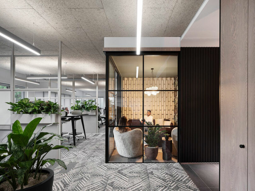
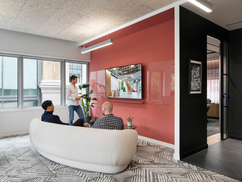
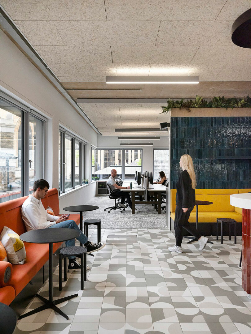
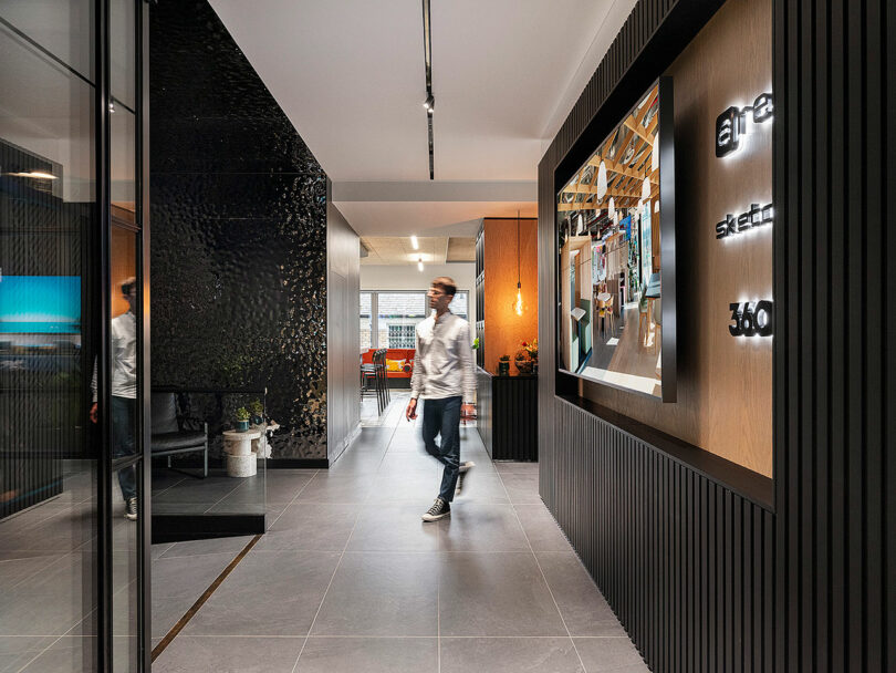
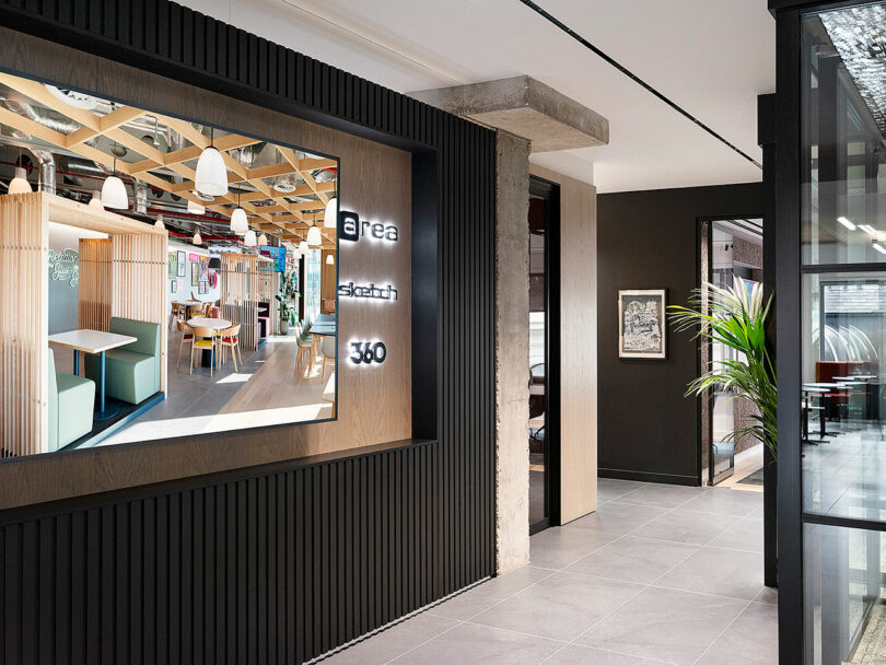
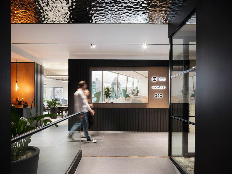
There is a clear demarcation between the work zone and entrance. As visitors step inside of the workplace, they are surrounded by sophisticated dark hues in the front section, and treated to glimpses of the lively office as everyone moves about during the day. This simple division allows guests and clients to enjoy their experience without disrupting the staff, perfectly balancing transparency and privacy.
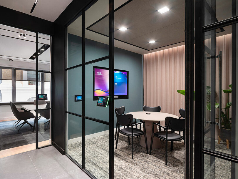
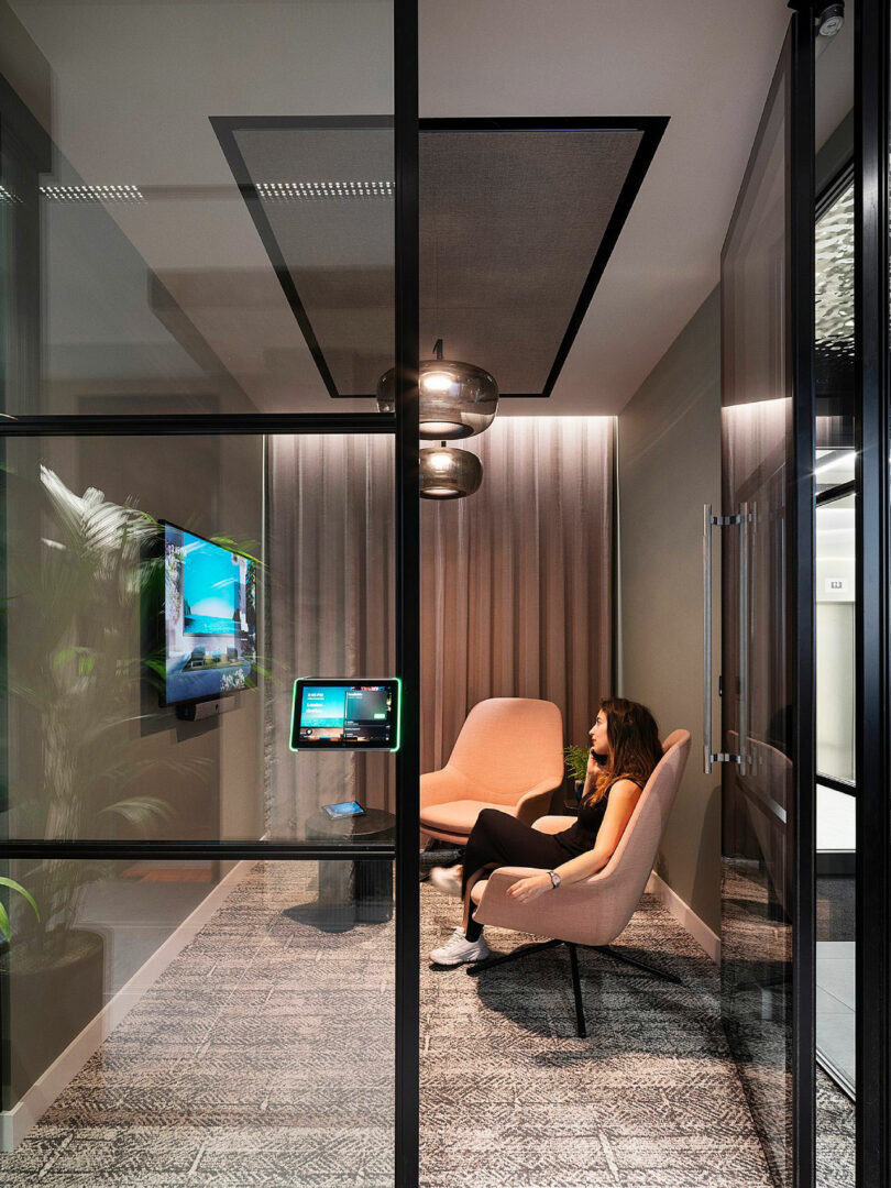
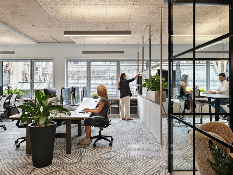
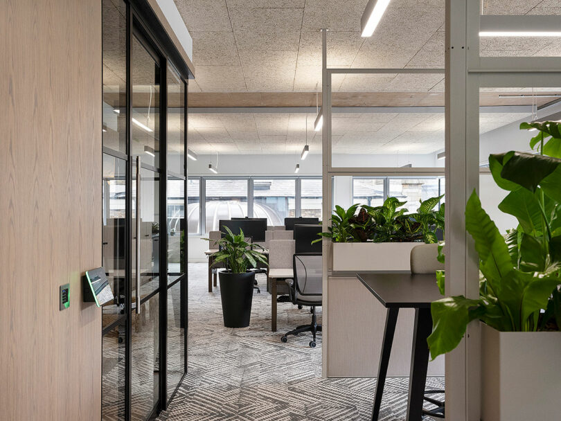
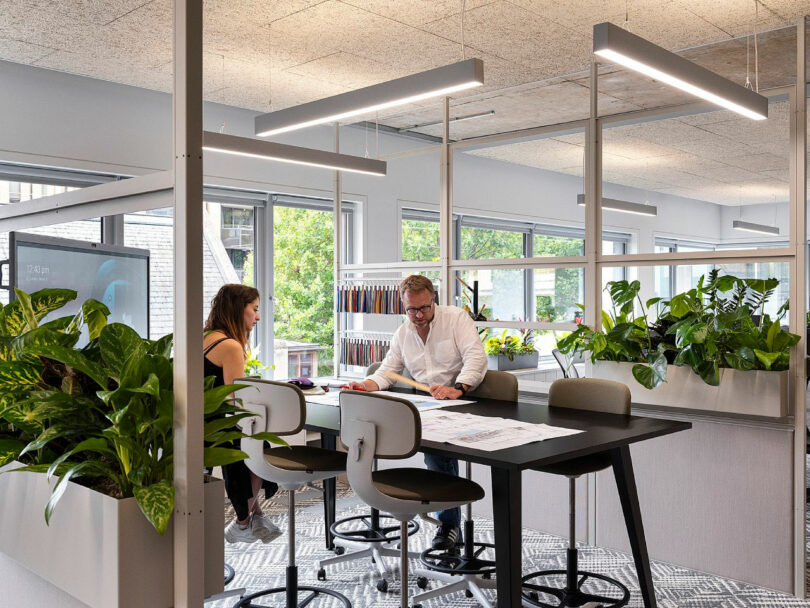
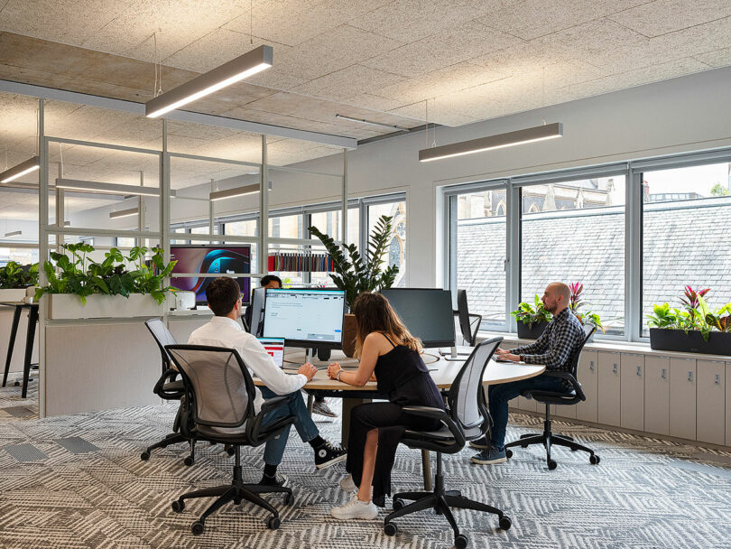
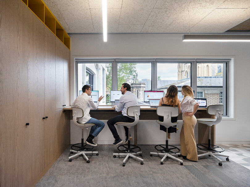
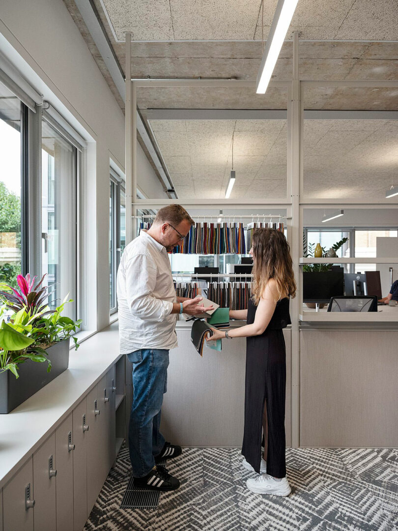
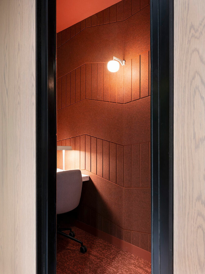
With desk space for 40, the architects can work at tables with various heights, look at fabric samples, or review plans in plenty of natural light. Individuals can also complete tasks in focus rooms. These quieter spots are complete with acoustic felt panels which help to reduce noise. Placed on ledges and on the floor of the office, potted plants provide welcome touches of nature and fresh pops of green color – which complement the firm’s own signature verdant hue.
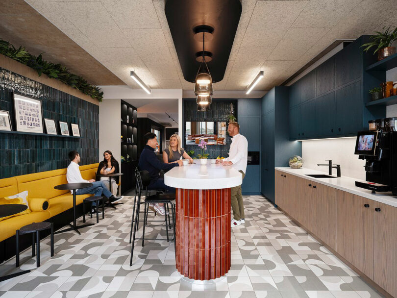
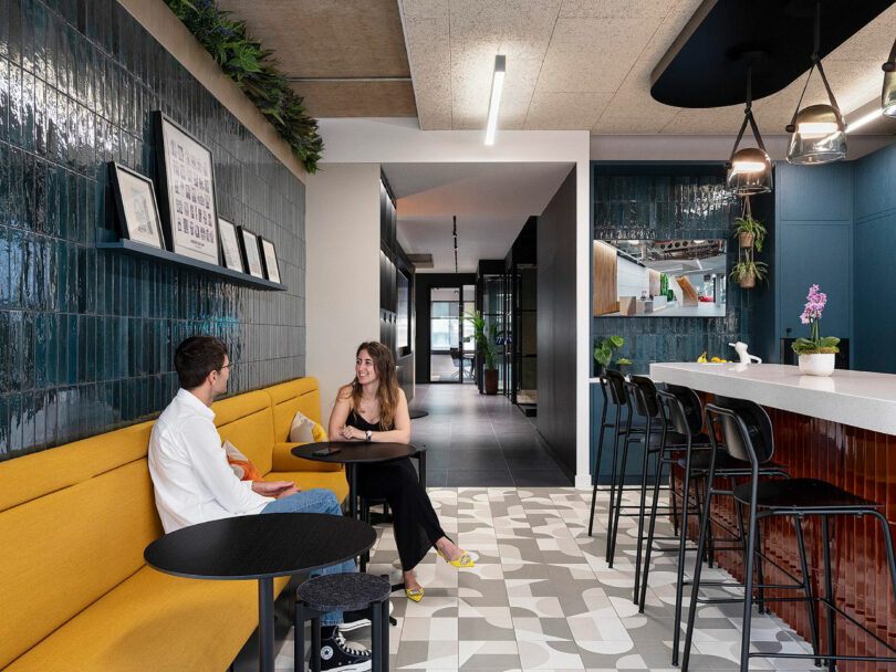
The kitchen, surprisingly, is the central hub of Area’s workspace. Situated at the back of the building next to a fire escape in the original plan, it inadvertently obstructed collaboration among colleagues. By transforming this particular sector, it is now a place that fosters interaction, where people can naturally gather to share meals or conversation. The designers chose what they describe as a mature color palette for most of the areas, but they played with bolder shades and texture in the galley. Glazed ceramic tiles in indigo adorn the walls, while fluted pieces in a rich terracotta tint surround the island’s base, adding dimension.
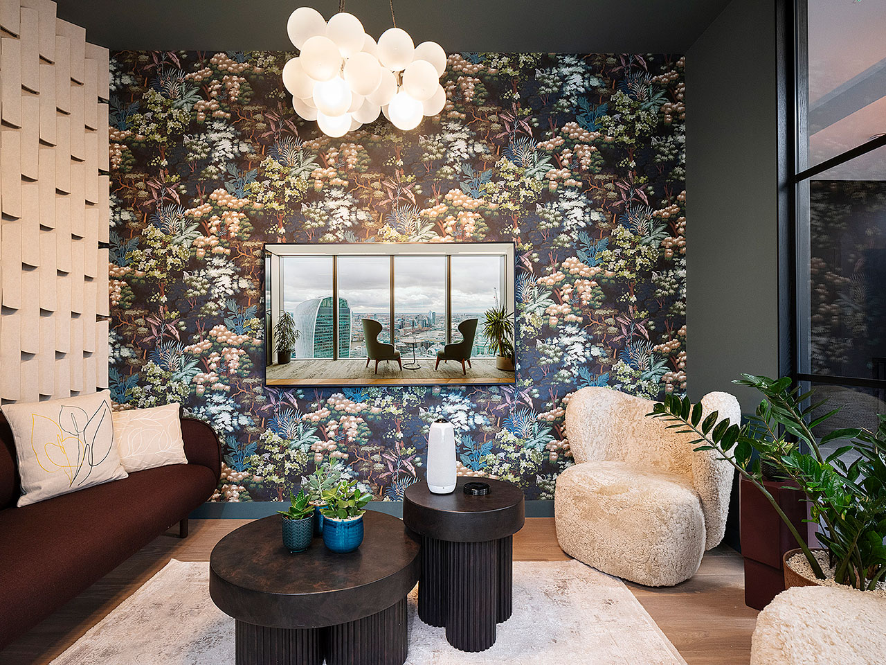
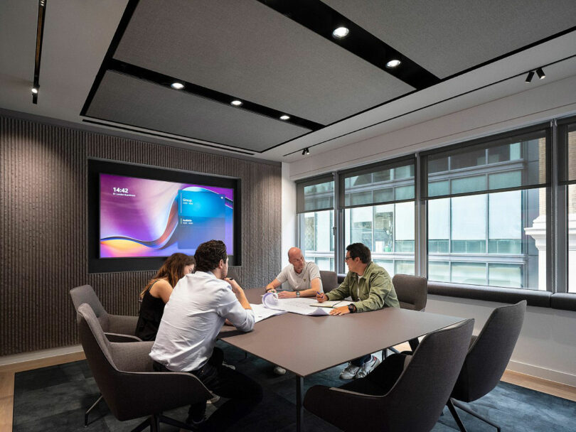
Every meeting room has a distinct look and color scheme, like the boardroom, which is utilized for key meetings. Highlighted in muted purple and gray, the interior is conducive to key decision-making sessions. The lounge room, meanwhile, is reminiscent of a hospitality setting. Decorated with a tropical motif wallpaper and furnished with soft seating, it’s a mini oasis.
Area’s London space is more than a typical architecture studio, it reflects their ethos. “We’ve built a space that meets our business needs, but it has also emphasized our culture and unique energy. Our people want to be here,” Geekie adds.
For more information on Area, visit area.co.uk.
Photography by Henry Woide.

