Mercedes-Benz, the car manufacturer known for bringing luxury to four wheels, has a new headquarters in Istanbul, Turkey, by Boytorun Architects. The expansive hub features a series of bright spaces that accommodate a variety of working styles while encouraging collaboration.

One of only eight licensed firms that the automaker cooperates with globally, the architects have already completed showrooms for the brand. Yet this latest project was a departure from Mercedes-Benz’s signature sleek interiors. The company decided to relocate from an industrial area near one of their factories to a bustling central district – next to a shopping mall.
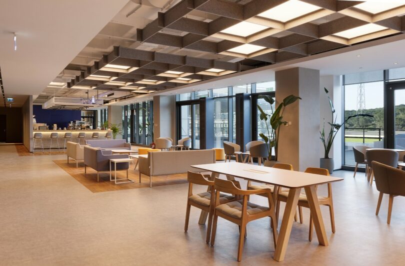
A marked contrast from the previous gray zone of concrete, the surrounding storefronts are elements of a vibrant streetscape in the country’s largest city. “The office is now in the heart of Istanbul, with stores and a younger population,” says Semih Boytorun, managing partner at Boytorun Architects. “There’s a different energy and we wanted to reflect that.”
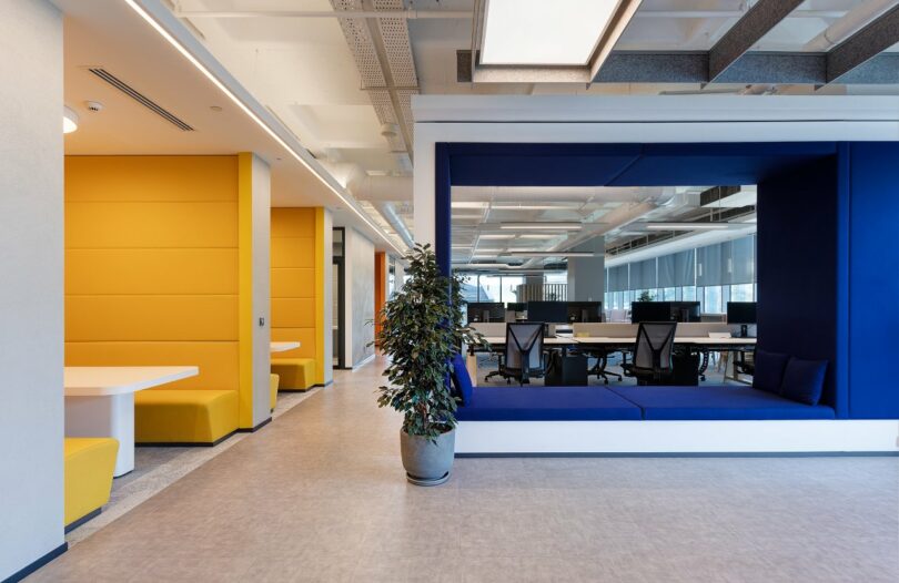
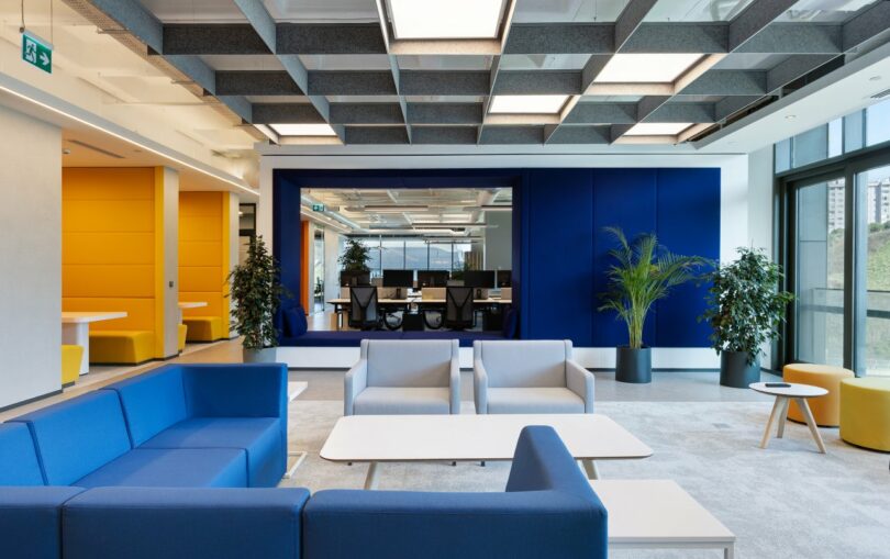
With 10 floors of 15,000 square feet each in the building, the architects wanted to capture the same community-like feeling outside and bring it indoors. The main circulation route forms a central loop around the core, which allows employees from different departments to spontaneously come together. This seamless flow fosters a sense of belonging among the staff members, who perform various functions from IT services to marketing.
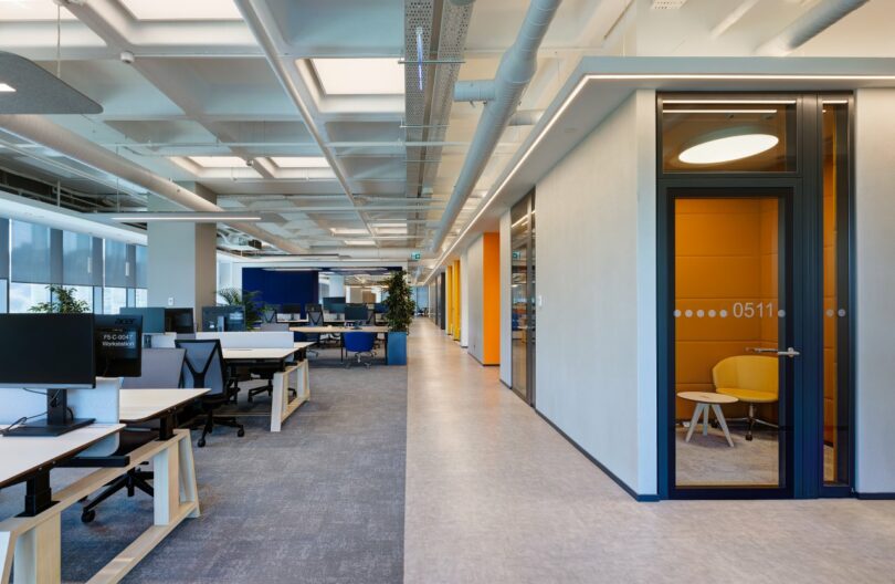
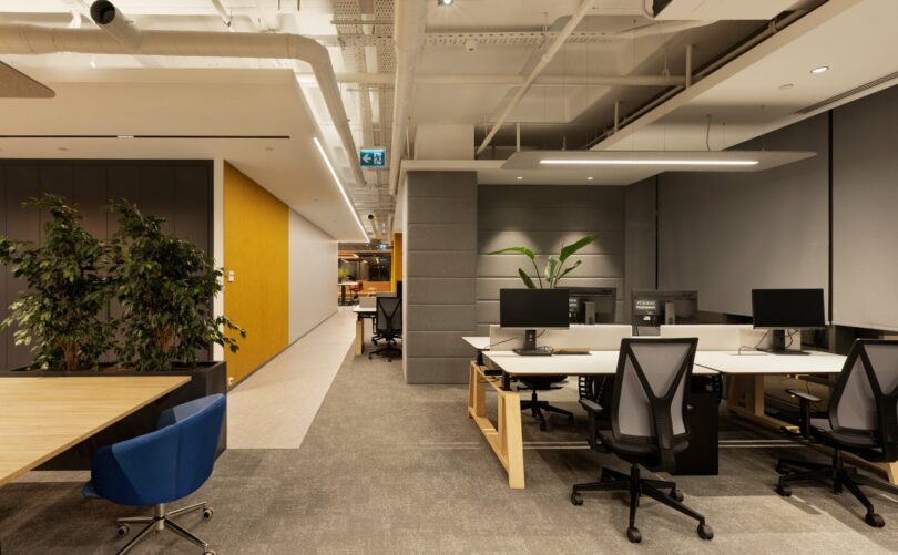
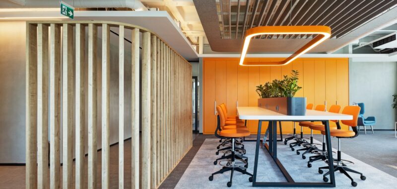
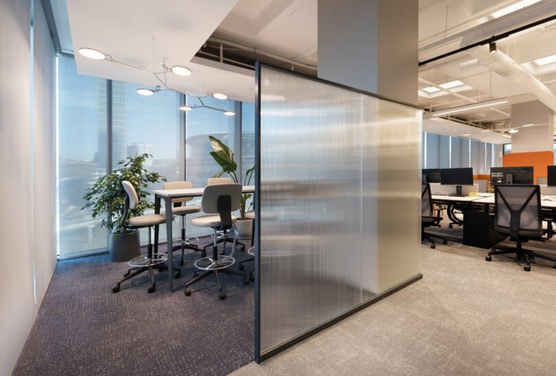
Employees adhere to a hybrid schedule, so flexible options abound. A mix of closed and open environments are easily accessible on each floor. The workstations and long tables are located in the center, surrounded by slatted oak partitions and touches of greenery, which keeps sections airy and light. Huddle rooms and booth seating along the perimeter allow individuals to perform quiet, heads-down work or have small group check-ins with a few colleagues.
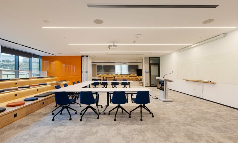
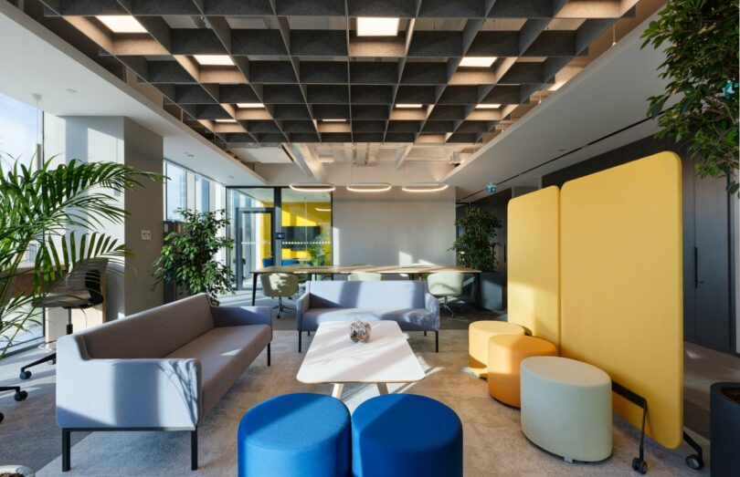
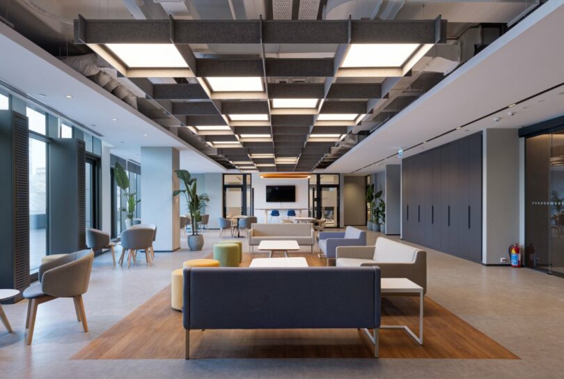
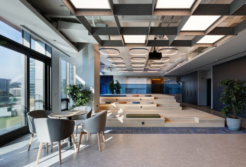
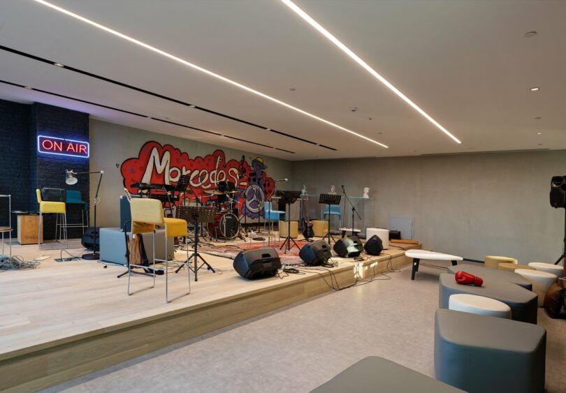
Places for socializing in the office called squares are key, strategically located at the entrance of each floor. Teams host weekly meetings, training sessions, and events in these communal spots for gatherings, and celebrations, too. The popular music room, with graffiti-style artwork, includes a collection of instruments and speakers. Staff often provide their own entertainment, with a lively jam session (or two) during the day.
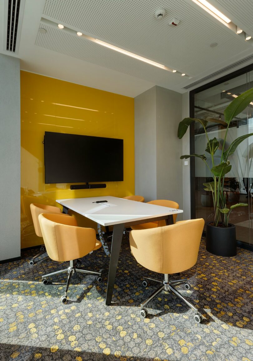
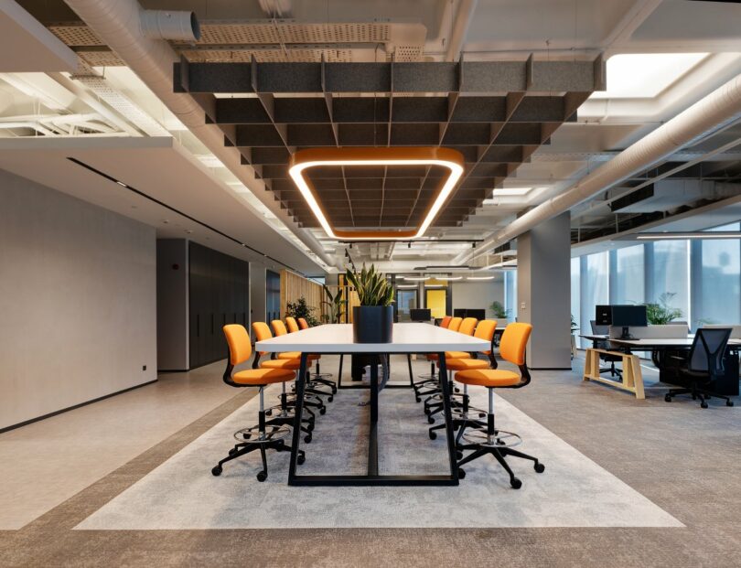
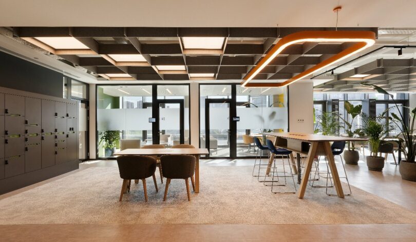
Ceiling baffles help to mitigate noise, and the grid formation of the acoustic treatment is a nod to classic radiator grilles. References to the Mercedes-Benz three-point star logo, however, are surprisingly sparse, with branding limited to the reception area. Color defines the sectors of the workspace, alternating between muted and vivid tones.
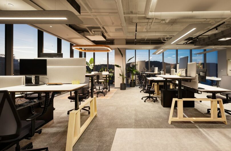
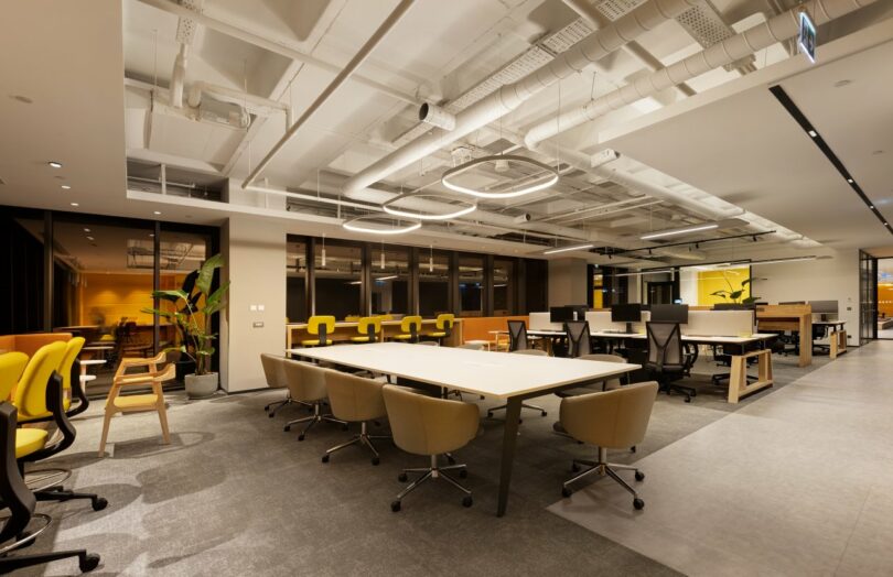
Subdued, creamy tints highlight focus or relaxation zones, and bolder hues enliven co-working spaces. It’s a spectrum that is the antithesis of the gunmetal, blackened steel, and silver metallics that evoke powerful engines. Splashes of yellow, blue, and orange provide enough of a spark for the workers, who are usually in the office two days a week, without overwhelming the senses. The headquarters invite a spirit of cooperation, just as much as innovation – by design, of course.


To learn more about this and other projects by the firm, visit boytorunarch.com.
Photography by Gurkan Akay.

